Brand Guidelines
This brand guide provides a clear framework for maintaining the integrity and consistency of the Eternal brand identity. It outlines how the logo should be applied across different contexts to ensure a cohesive and professional brand presence.
Following these guidelines helps Eternal remain clear, recognizable, and consistent across all touchpoints.
Contents
01. About The Brand
Think Apple. Think Eternal.
Built on trust, quality, and care, Eternal is where premium Apple products meet real value. With curated MacBooks, honest pricing, and a clean, modern vibe, it's a go-to for creators, students, and savvy buyers alike.
Whether upgrading your setup or buying your first Mac, Eternal makes it simple, secure, and seamless.
Eternal operates in the tech resale space, combining affordability with premium quality. It's positioned as a trustworthy source for MacBooks at fair prices, appealing to customers who seek value without compromising quality. The brand strives to deliver a premium buying experience, despite being in the second-hand space.
Our Values
Strict Curation
Every device is hand-picked and rigorously tested to ensure a flawless, premium experience.
Total Transparency
Honest grading and upfront pricing with no hidden flaws, ensuring you know exactly what you're buying.
Enduring Care
We don't just sell; we serve. Dedicated support that extends far beyond checkout for peace of mind.
Real Value
Bridging the gap between premium tech and affordability, delivering the Apple experience without the markup.
Who We Serve
Apple-First Customers
People who love the Apple ecosystem. You want the full premium experience, seamless integration and quality but are looking for a smarter, more trusted way to buy.
Value-Driven Buyers
Smart shoppers seeking the intersection of quality and price. You refuse to compromise on performance, seeking real value where premium products meet honest, transparent pricing.
Creatives & Students Alike
From lecture halls to editing suites, great work requires great tools. We provide premium power without the markup, giving you the freedom to learn, create, and succeed.
Tech-Savvy Upgraders
For those who know exactly what they want. You prioritize specific specs and real performance. We deliver curated, strictly tested devices that meet your high standards.
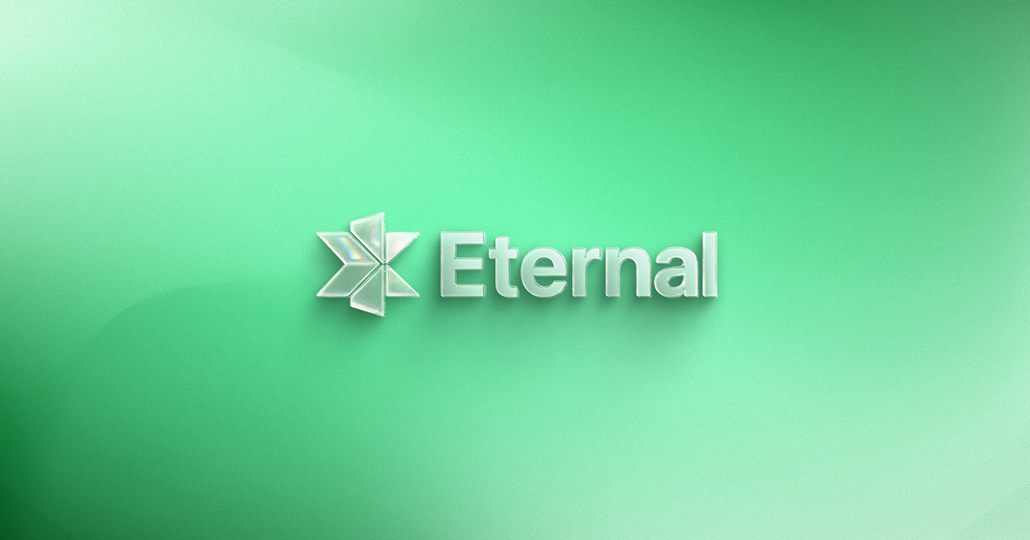
02. Logo
The heart, soul, and center of our brand identity.
Our logo is how our customers tell us apart from a crowded industry. It's a promise of quality, consistency, and reliability.
As such, it is vital that our logo is presented correctly in every execution. This section covers these guidelines in detail.
At the Core of Every Mac
Imagine three MacBooks in motion, unfolding, intersecting, converging. Inspired by the elegant reveal moments from Apple's own product launches, this concept brings that energy to life.
It captures Eternal's core: trusted, curated tech delivered with precision and clarity. A symbol born from movement, balance, and the belief that great value lives at the intersection of trust and quality.
Primary Lockup
What our icon stands for
Macbook
The core shape is inspired by the clean silhouette of a MacBook with its lid open.
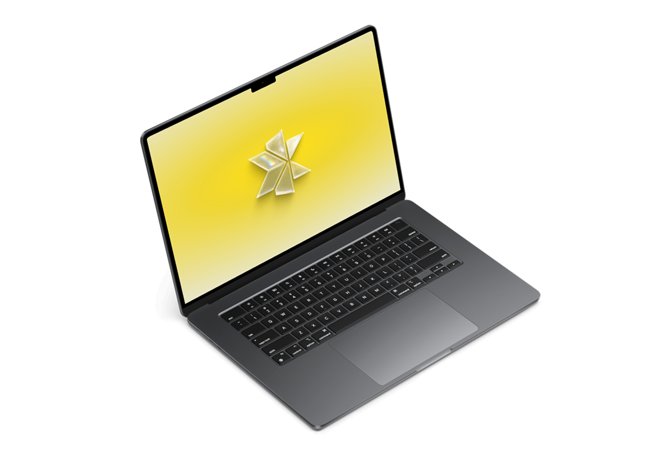
3 Macbooks in star composition
Three MacBook silhouettes converging to form a unified, forward-moving star.
Center Point
The exact center point where trust, technology, and real value converge.
Logo Construction
A Scalable Identity System
Balancing the representation of our logo on both a billboard and a small flyer presents a unique challenge. Our versatile identity system is crafted to ensure adaptability, uniformity, and brand recognition.
We offer a range of logo arrangements that cater to diverse spaces. Instead of struggling to fit the logo into tight or crowded spots, opt for an alternative version to achieve a stronger visual impact and clear representation.

PRIMARY LOCKUP
VERTICAL LOCKUP
ICON-ONLY
Primary Lockup
The brand logo identifies the Eternal as a whole. Use this logo to represent individual locations, products, merchandise, and wholesale operations.
This logo is a carefully created piece of locked artwork that should not be altered in any way.
 .45" or 32px
MINIMUM SIZE
This version is not intended for extremely small sizes. The minimum height is .45" for print applications and 32px for digital applications.
Secondary Lockup
Designed specifically to be vertically efficient, the secondary lockup is a perfect fit for taller areas, and areas where a centered lockup would fit better.
While we generally prefer the full horizontal logo, there are no specific restrictions that would prevent this version from use.
1.4" or 64pxMINIMUM SIZE
This version is not intended for extremely small sizes. The minimum height is 1.4" for print applications and 64px for digital applications.
Icon-only Lockup
When subtlety is desired, the Eternal icon can be used in place of a full brand logo lockup.
When this mark is used, ensure that our brand name is visible near or in relationship with the icon. This will help reinforce brand recognition.
0.6" or 48pxMINIMUM SIZE
This version is not intended for extremely small sizes. The minimum height is 0.6" for print applications and 48px for digital applications.
Color Variations
Each brand logo lockup has several color variations for use on different background types, tones, and colors.
When in doubt, use the most legible version of the logo for the available background.
For printed executions, special care should be given to ensure logo legibility on the final media or material used.


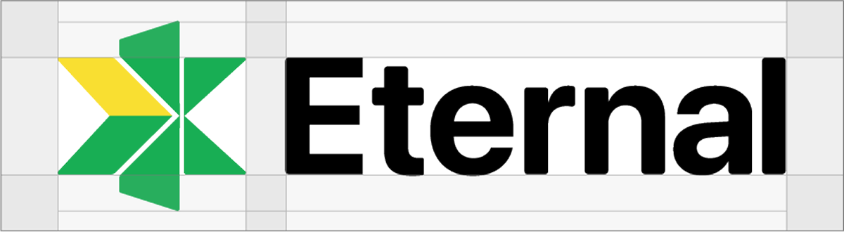
Clear Space
Clear space, or negative space, is the area that surrounds the logo that is completely clear of any other graphical element. Clear space helps the logo stand out from the rest of the elements on the page and ensures legibility, even at small sizes. As a general rule, the more clear, or negative, space around the logo, the better.
At a minimum, there should be clear space equal to the height of the Network icon on all four sides of the logo. Using an element from the logo as a unit of measurement ensures enough clear space at any size.
Incorrect Usage
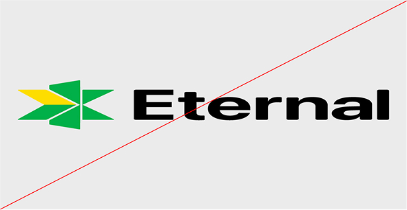
Do not stretch, squash, distort or skew the logo in any way
Do not edit the logo color or use an off-brand color, or reduce the logo opacity.
Do not add graphic effects to the logo, including drop shadows.
Do not place the logo on a high-contrast pattern or busy photograph.
Do not encroach on the required clear space surrounding the logo.
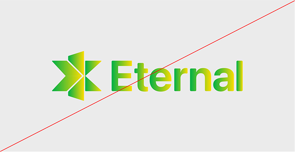
Do not use any gradients on the logo, including brand color gradients.
03. Colors
Color sets us apart & helps to invoke emotion.
The colors we've chosen for our brand is a key factor in differentiation and brand recognition.
As such, it is vital that our colors are reproduced faithfully and combined in the right way. This section covers these guidelines in detail.
Primary Color Palette
The consistent use of color is vital to effective brand recognition.
Our brand should always be represented in one of the colors on this page, aside from specific recommendations within this guide. Do not use any other/unauthorized colors.
Eternal Green
Hex: #00B048
RGB: 0, 176, 72
CMYK: 81, 0, 100, 0
Eternal Yellow
Hex: #F9DF30
RGB: 249, 223, 48
CMYK: 4, 7, 91, 0
Neutrals & Tints
We prefer our brand colors used without editing, but some situations require the use of color tints, especially on the web. For example, when a user hovers over a button on our website, using a tint change can help confirm their action.
If necessary, use a 20% tint step system, keeping legibility in mind. Any tint below 60% used as a background will require dark text.
100%
Hex: #00B048
80%
Hex: #45BD76
60%
Hex: #74CE98
40%
Hex: #A2DEBB
20%
Hex: #D1EFDD
100%
Hex: #F9DF30
80%
Hex: #FAE67B
60%
Hex: #FBE98D
40%
Hex: #FCEEB2
20%
Hex: #FDF6D6
Black
Hex: #000000
Dark Grey
Hex: #CFCFCF
Grey
Hex: #F4F4F4
04. Typography
Few things communicate the look and feel of a brand more clearly than the way letters, numbers, and symbols are put together. We believe typography should strike a balance between legibility and interest.
This section will cover approved typefaces, the way we use typography to communicate clearly, and some helpful usage tips.
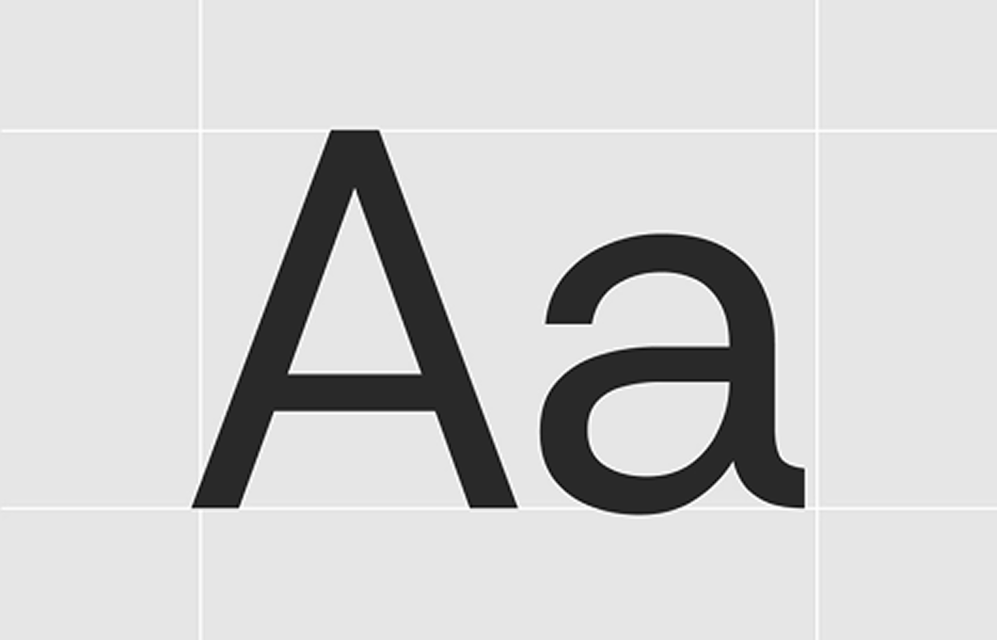
We are obsessed with the beauty of typography.
Primary Sans-Serif, SF Pro is a clean, modern sans-serif typeface that ensures legibility and precision across all digital and print materials. Its geometric structure reflects clarity, efficiency, and trust, making it the ideal choice for data-heavy content, dashboards, and user interfaces.
Primary Typeface
SF Pro
The typeface we chose
for all brand execution
Hierarchy & Weight
SF Pro is a very versatile sans-serif font that excels in establishing a clear typographic hierarchy.
Its range of weights and styles allows for seamless differentiation between headings, subheadings, and body text, ensuring every piece of content is well-organized and visually appealing.
SF Pro Light
SF Pro Regular
SF Pro Medium
SF Pro Bold
05. Visual Style
Ingredients for on-brand layouts and composition
While brand consistency relies heavily on logo usage, color, and typography, we recognize that these are not the only elements within a brand identity design system.
This section contains approved visual elements like icons and patterns.
Iconography
Iconography is an essential part of Eternal's branding, used across marketing, digital platforms, and wayfinding. Our carefully-crafted icons embodies our design philosophy-bold, geometric, and purposeful.
We favor thick outlines and clean, structured forms that distill subjects to their core essence. When creating new icons, maintain simplicity and consistency with our existing visual language. Icons should always remain fully visible, with clear spacing to ensure clarity and impact. Their shape, line weight, and structure should not be altered or repurposed as part of the Eternal logo.
Download Icon Pack
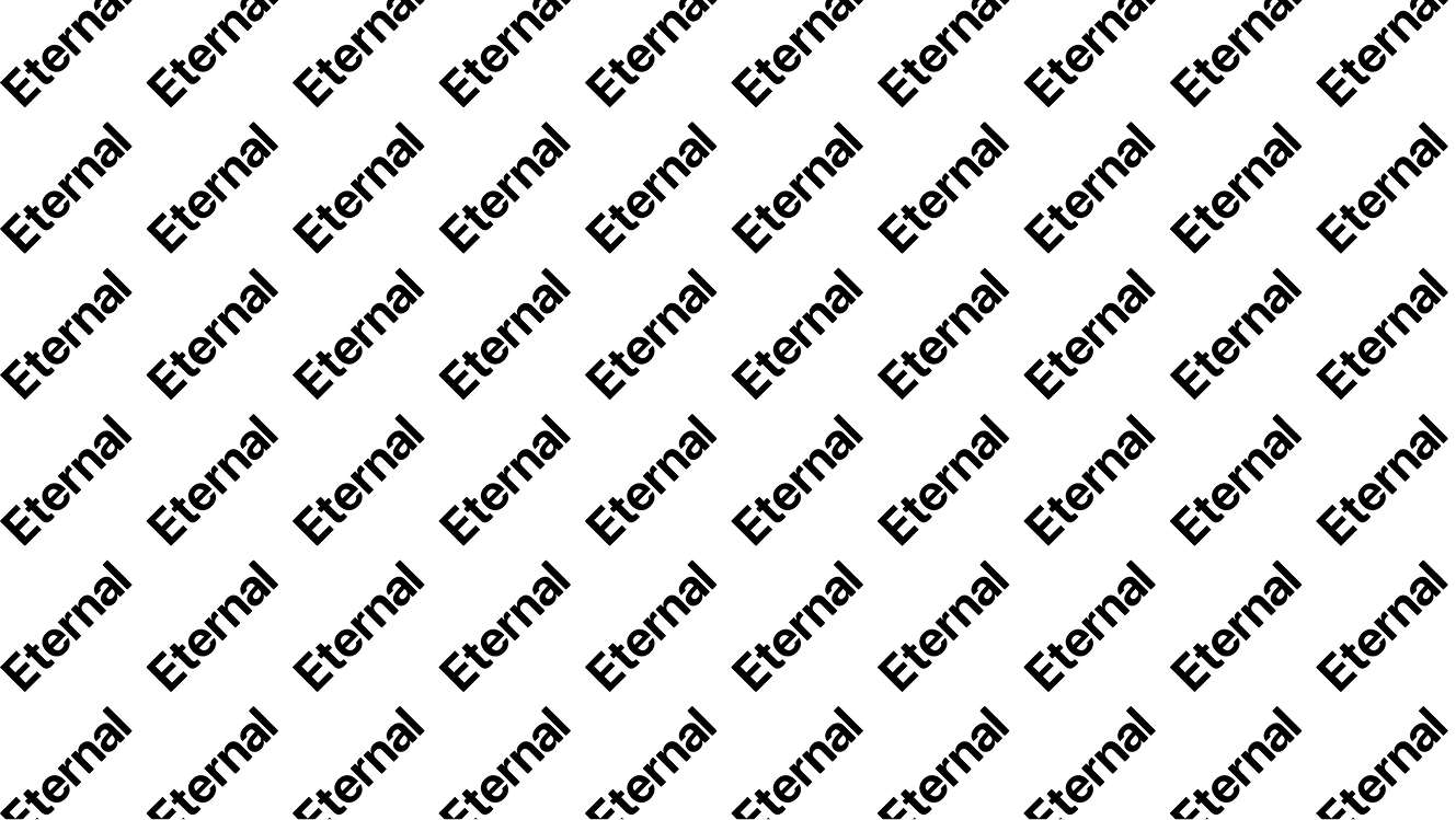
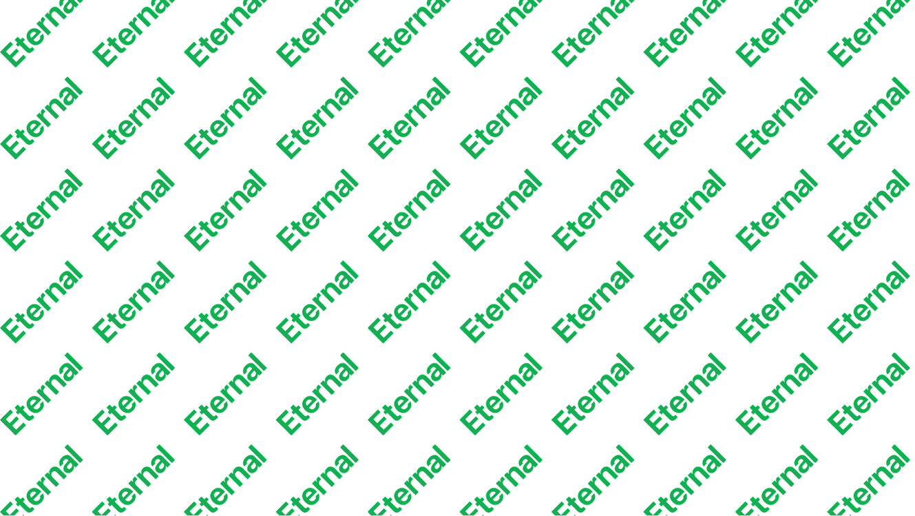
Patterns
We have developed 4 pattern styles that are approved for usage as backgrounds, inprint materials, and in packaging. When using these patterns, feel free to invert the colorways (switch the background and foreground colors), but do not otherwise modify the colors.
Download Patterns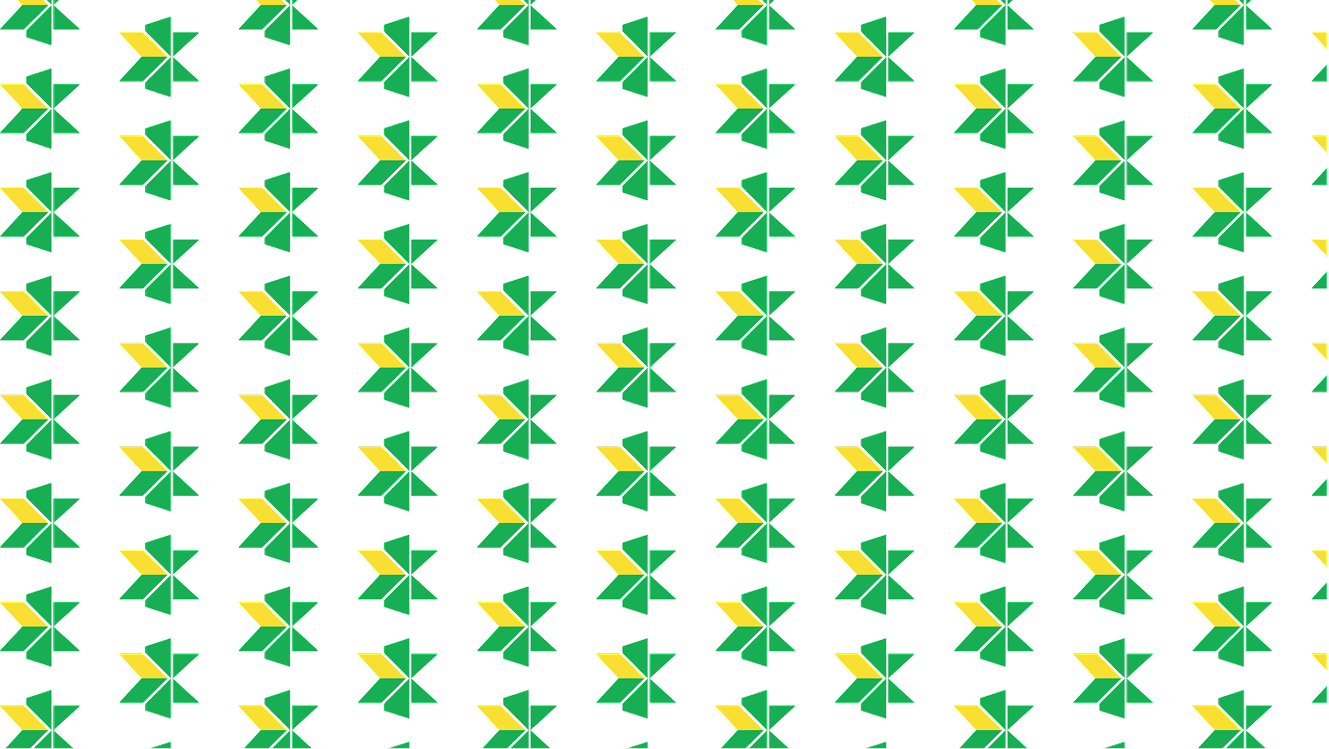

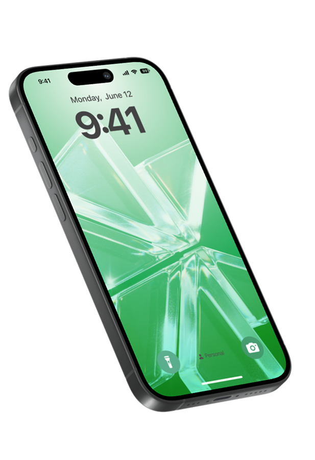
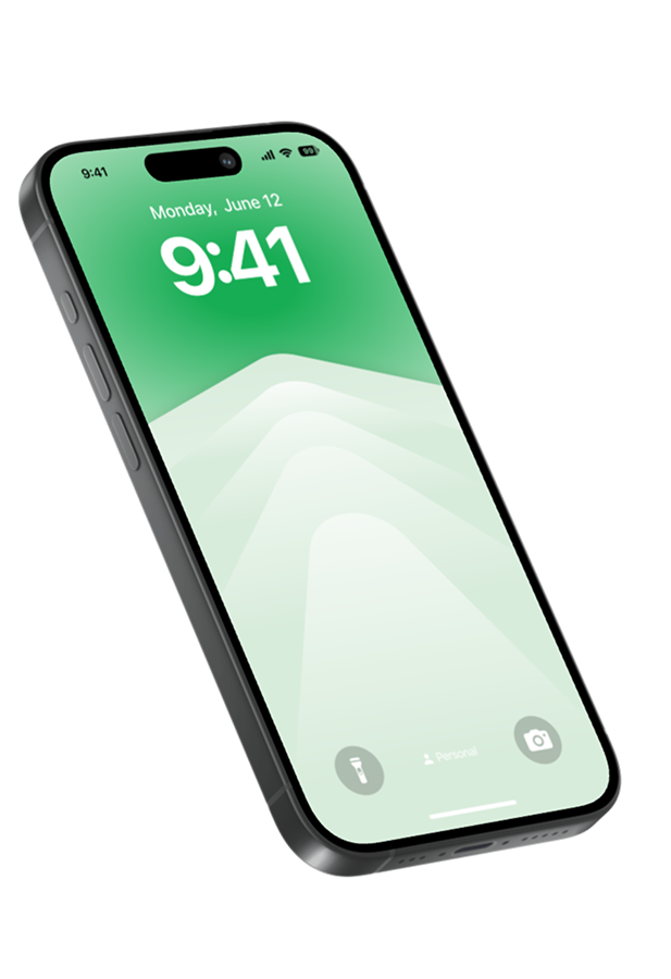
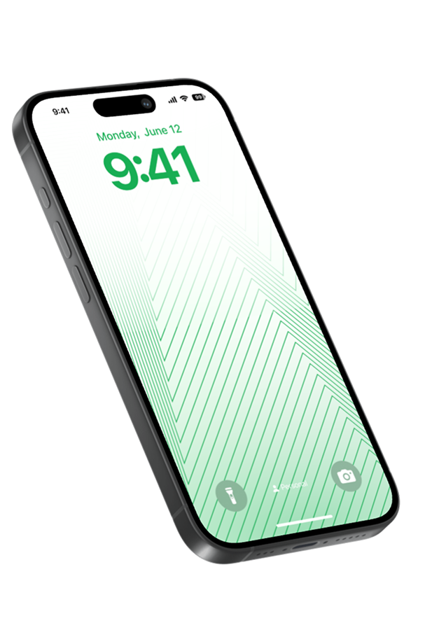
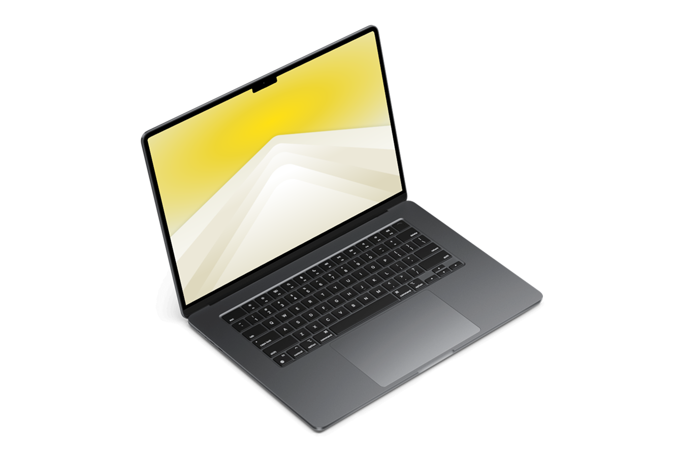
Custom Wallpaper
Extend the Eternal branding to your digital workspace. Our custom wallpapers feature the signature linear star pattern, designed to perfectly complement the sleek, minimal look of your Apple devices.
Available in multiple color variations to match your style—from minimal white to our signature green, and fully optimized for both MacBooks and iPhones.
Download Wallpaper Pack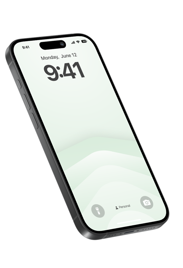
06. Brand Collaterals
Brand collateral is an essential extension of Eternal's identity, ensuring a unified presence across all physical and digital touchpoints. Our meticulously designed assets embody our commitment to excellence, clean, cohesive, and professional.
From business cards to letterheads, these materials should be used as designed, ensuring every interaction feels seamless and premium.
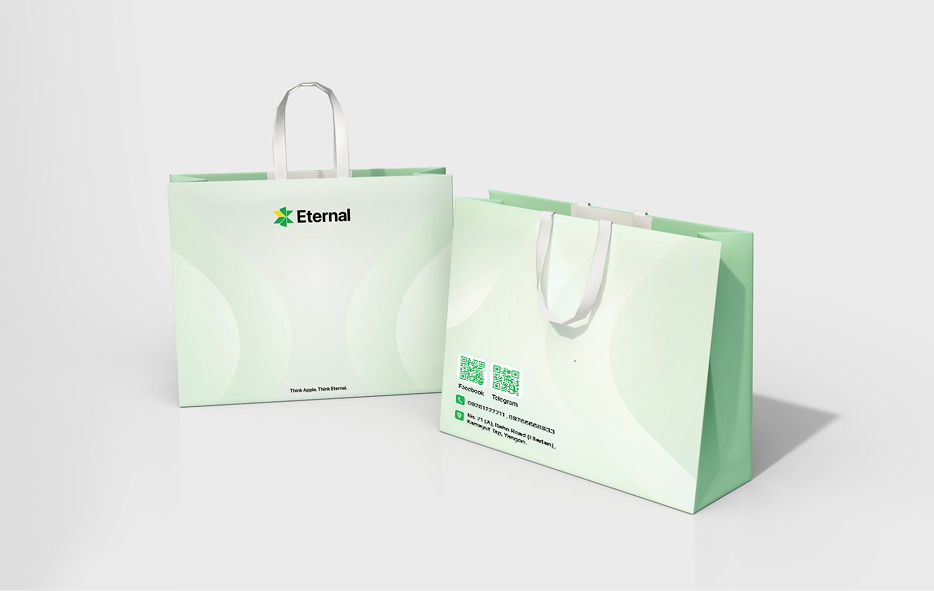
Retail Bag
Extend the premium experience beyond the store. Our minimalist bag design turns every purchase into a statement of quality, carrying the brand promise into the real world.
Download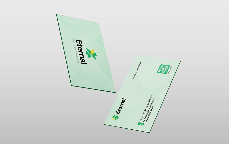
Business Card
Make every connection count. Featuring clean typography and our signature green, this design reflects precision and professionalism to leave a lasting impact.
Download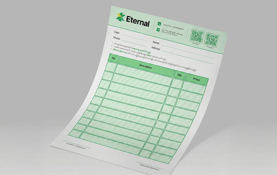
Invoice
Professionalism in every detail. This template ensures clarity and trust in every transaction, reinforcing Eternal's reliability across all administrative touchpoints.
Get Access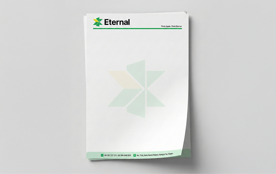
Letterhead
Communicate with authority. A clean, structured framework for official correspondence that ensures every message is delivered with Eternal's signature polish.
Download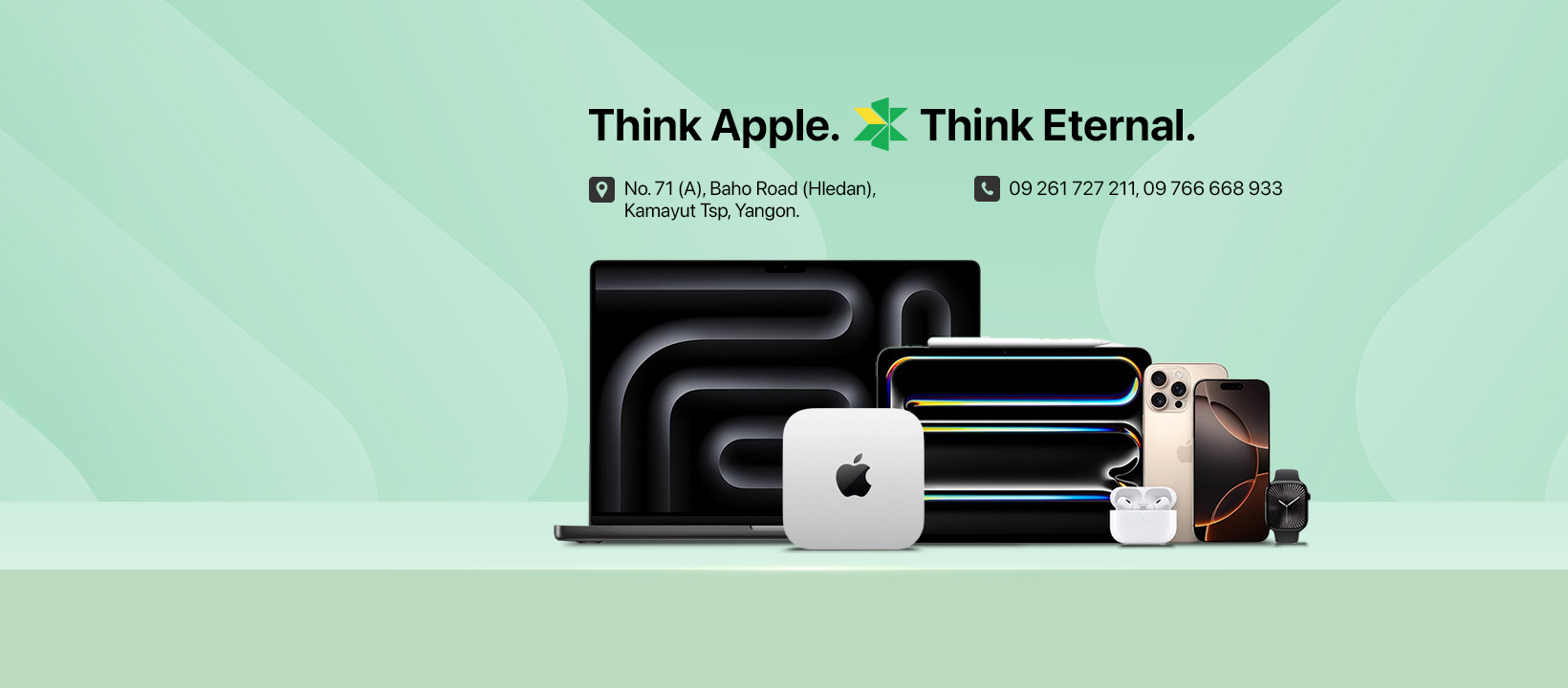
Cover Image
Make a strong first impression. These branded headers feature Eternal's signature aesthetic, ensuring your digital profiles look professional, unified, and instantly recognizable.
Download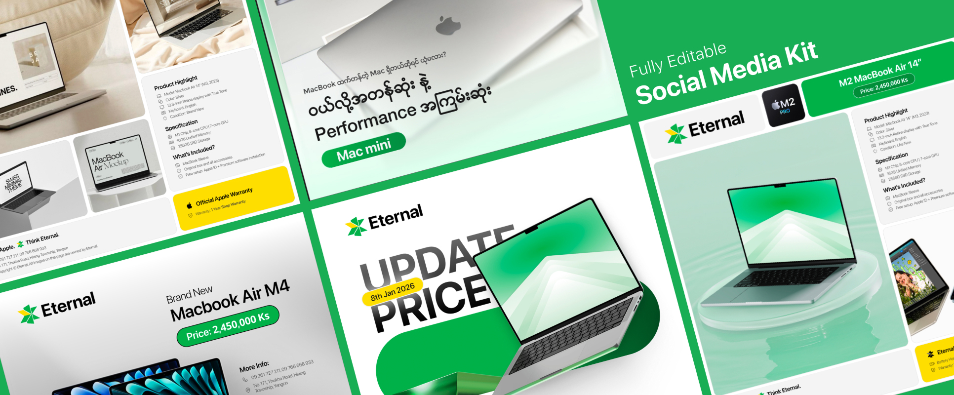
Social Media Kit
Streamline content creation with fully editable templates. Designed for engagement, these layouts maintain brand consistency while showcasing products with clarity and modern style.
Get Access